Loupe 4.0 - New Web Look & Feel
Modernizing the User Experience
While developing Loupe 4 we knew we were adding a lot of new UI functionality that would require brushing up the look & feel of the application. We met with our favorite UX guys, RocketMakers in the UK, and they weren’t inspired by our plan. Instead, they felt it was time to go farther - a lot farther. They did the original UX design for the Loupe web UI back in 2011 (although it didn’t ship until 2013) and made a compelling case that it was time to significantly update it. The main drivers for this update were to handle the increased complexity of the new UI, provide at least a modest amount of responsive design (We want the web UI to scale smoothly from an iPad Mini up through a large desktop) and modernize the fonts and layout.
Web UI trends have evolved considerably in the past four years. Modern web applications use a minimum of explicit chrome (borders, shading, etc.) and are expected to natively support a wide range of DPI from the traditional 96-dpi desktop up to “retina”-style displays (typically 250-dpi or more). Gradients and other 3-D perspectives are out of fashion, replaced by a flat look. When done right, the site calls attention to the data you need to see instead of the structure and flourishes of the site itself. Typically this places a premium on negative space in the layout - white space and other blank areas designed to let the user visually group data in different combinations without explicit borders and boundaries.
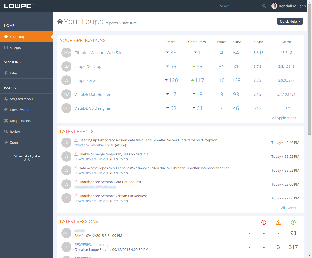
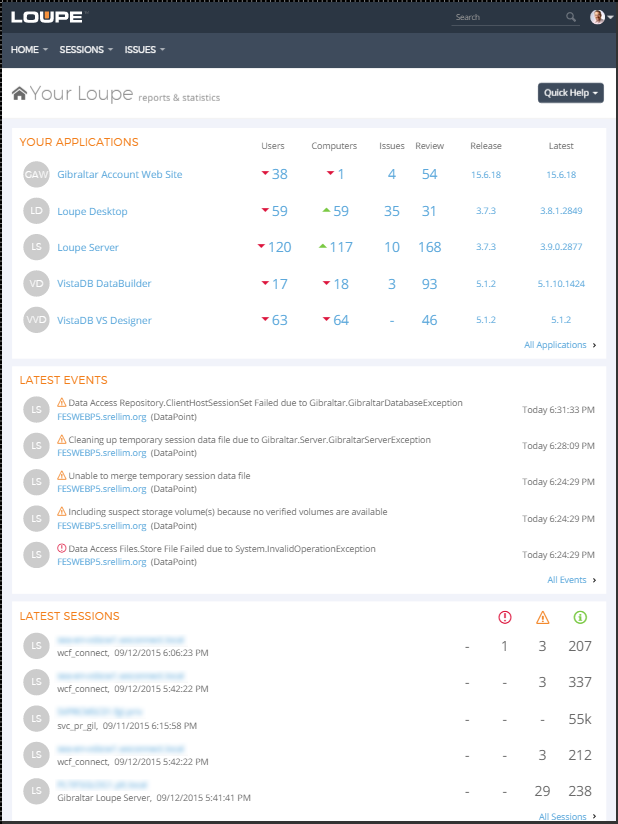
Even though the new Your Loupe dashboard was designed with cards, notice how the data areas are separated without the use of border lines. More colors are used in the layout to differentiate structure and action without drawing your eye away from the data. All of the graphical items and fonts were picked to scale between a large range of DPI’s. While all of these screenshots are done at 96dpi it just looks that much better on a high-dpi display!
Fewer Grids, More Cards
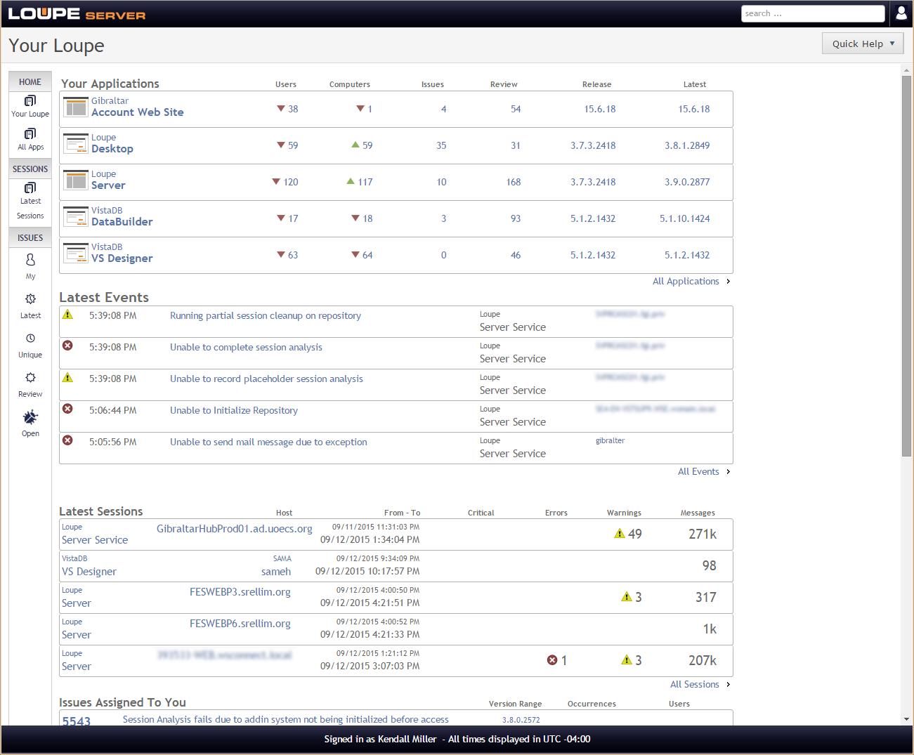
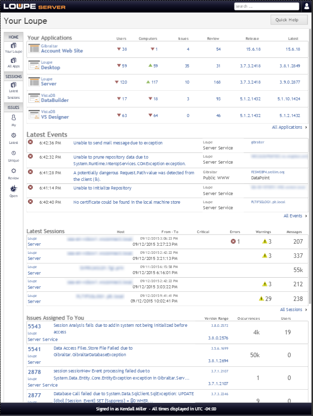
When we looked carefully at the UI we were concerned that frequently the key data a user needed to make a decision wasn’t easily visible without drilling in. The problem with a traditional grid layout is they need data to be pretty similar in length from item to item and can have relatively few items, particularly if there are any long values. Unfortunately, we tend to have a lot of long values that are important - notably the captions of log messages and issues. So, we’ve worked to replace many grids with carefully designed card views. For example, here’s the Latest Events dashboard using a grid and a card.
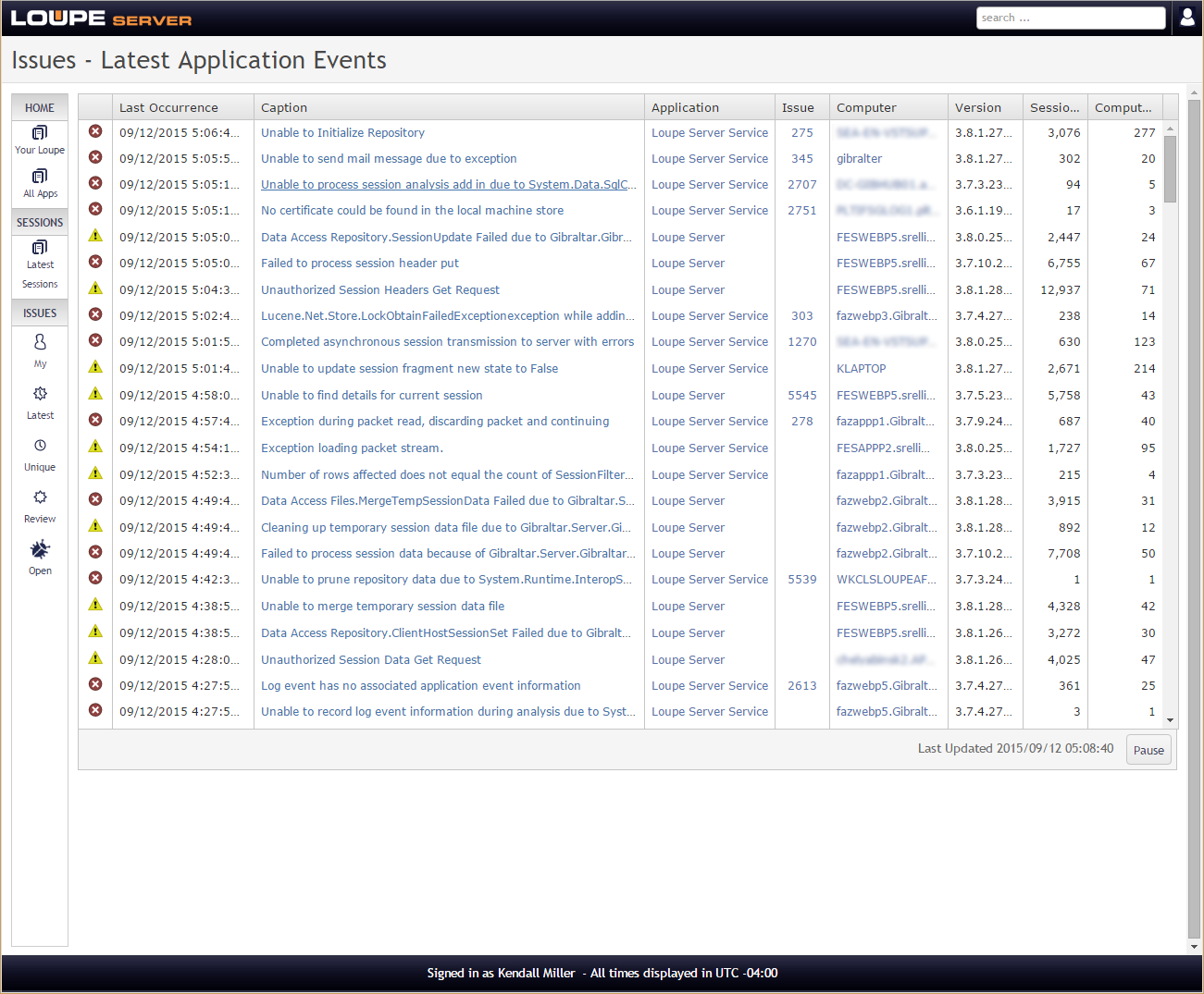
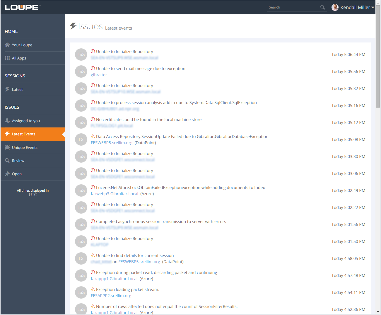
At first blush, the grid view appears very neat but in real use it has too little width to show all of the caption of most messages. Additionally, the lack of white space tends to make issues run together. The new card views are designed to be much more effective:
- Whitespace creates a visual ragged right edge for captions which helps the eye track data, particularly as it changes.
- The whitespace separating the timestamps makes it easier to reach each one.
- The use of relative timestamps (such as “Today at (time)”) helps place events mentally in relative time by hiding unnecessary detail.
- The symbolic application badge makes it easy to check what application an item refers to when it matters without tying up a great deal of space. The grey default badges help the user focus on applications when it matters but otherwise have the data fade into the background when it doesn’t.
We’ve been creating card versions for issues, events, sessions, users, and other key data items. While this came up late in the development process we’ve been able to swap out a number of grids for the card forms where we felt it’d make the most difference.
New Interactive Event View
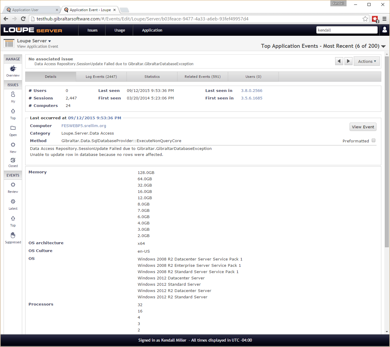
We examined the most common use cases for Loupe and focused on reducing the number of clicks necessary to make a decision or solve a problem. This drove the card view work (minimizing drill-in to answer basic questions) and pushed us to focus on ways of combining screens together. The biggest change we made was merging the Application Event and Log Event screens. This served two purposes: First, we were able to eliminate the distinction throughout the whole site between Application Events (unique within an application, across all sessions in that application) and Log Events (unique within a session, associated with one Application Event) which is confusing to new users. Second, we wanted to eliminate the drill-in previously required to see an exception. and its details since most of the times a user had to drill in it was to see the exception.
We made room for this change by eliminating the display of session characteristics on the first tab of the Application Event. Customer feedback told us this was not usually needed to answer questions and when it was they preferred the chart views since they showed the distribution. This created more room for us to show the essential information on one screen.
We also moved the Exception information from a secondary tab to the first tab since when it’s available (not all errors and warnings have exceptions) and emphasized the exception analysis when available since it represents the essential part of the exception and its stack traces in a very compact form.
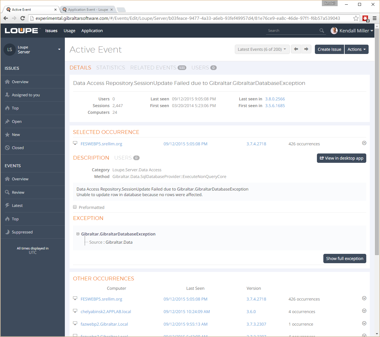
The new view somewhat goes against our goals of minimizing complexity and creating whitespace however usability testing has shown it is more effective at presenting information so users can make quick decisions.
Responsive Layout
Ultimately we’d love to scale down to the average phone, but to start we set our eyes on an iPad mini which has one of the smallest displays in common tablet use. While the old layout did scale down, many click targets became too small to reliably hit with touch. By restricting the navigation as the screen shrank, coupled with adjustments in the spacing of the new cards, the same volume of information is displayed but key information is larger and it’s easier to use.
Like What you See?
This new look & feel is ready today - it’s already deployed for all customers of the Loupe Service and available for download today. If you’re not already a customer, take advantage of our free trial to try out our new user experience. We’re confident you’re going to love it!