Incremental Changes Only Take You So Far
Over the past decade we’ve expanded Loupe substantially. Each time we add a new block of functionality we’ve found a logical place to put it in the Web UI. Through each major release the navigation has gotten more elaborate and the UI less focused on any single particular task.
While planning for our next major block of functionality we did a round of usability testing and found even experienced customers were having trouble knowing the optimal path through the Web UI for any particular goal. Reviewing the recordings we saw a two key problems that we decided had to be addressed before we added any more complexity to the UI:
- Unnatural Decision Order: Users had to chose a scope of data and then decide what problem they wanted to solve, the reverse of how people typically make decisions.
- Poor Browseability: Users often want to browse the available data to find what they’re looking for because they intuitively believe they’ll know it when they see it. Instead, Loupe provides derived views focused on finding the right data on the user’s behalf.
Purpose-First Navigation

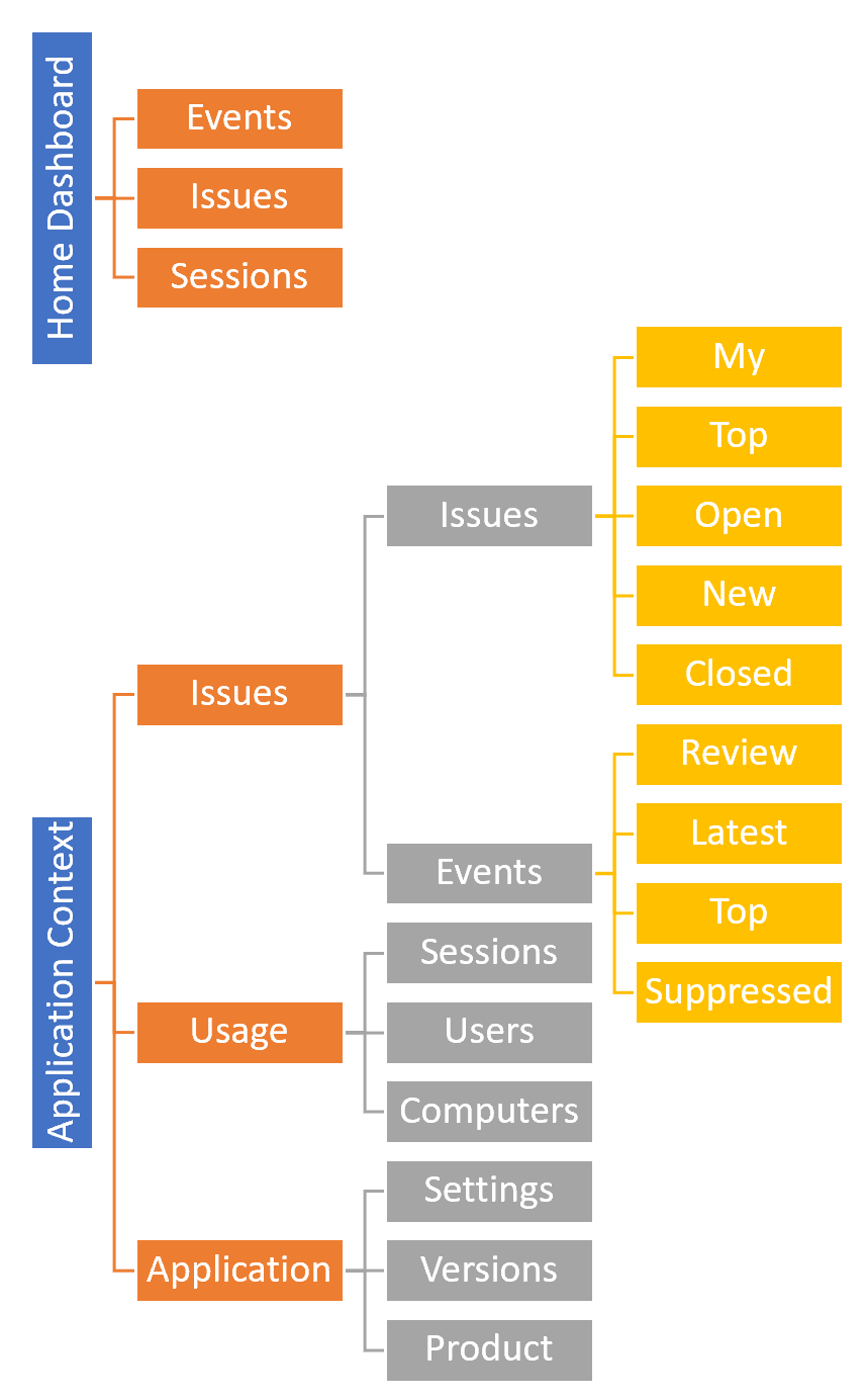
Debuting in Loupe 3, our Web UI started with significantly less functionality than today and was aimed at much smaller data sets than the current average user has. It had a very simple dashboard - just a list of applications - and once you clicked on one you got put into the only functionality we exposed: a list of unique events for that application (and issues if you’ve made any). As we added additional functional areas we just placed them besides the original within the application.
For Loupe 4.0 we created the navigation structure shown at right.
To help users deal with larger numbers of applications and efficiently work across applications
we added a number of top-level dashboard views that spanned applications. We then effectively
split the UI into two main modes: Top level dashboards and “application context” views which were
the original functionality.
We attacked the problem users had of not being able to work through common sets of data (such as review lists or open issues) without losing context by creating what we call Activity Context. It kept track of the last set of items you interacted with so you could easily iterate through them one by one.
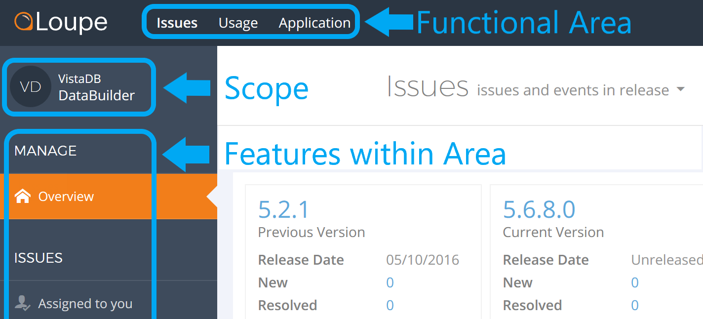
In other words, we’ve placed the user decision of scope (an application) and functional area (issues, usage, and application) as peers. Unfortunately, our reviews and telemetry tells us that this is not effective for users.

The main reason is that when users approach any tool (including software) they have a functional goal in mind: They have a problem and a perspective they expect that tool to solve. Users think purpose first. They want to understand X about data scope Y. This is the opposite of how the Loupe UI forces users to think.
Don’t Out-Clever the User
We’ve tried hard with Loupe to make sure the application is ahead of what the user is looking for. The key reason we had is the assumption that there’s too much data to display it all to the user, we needed to find the important parts and display them. For ourselves this worked well - we knew exactly what the rules are that the UI used and why they were picked.
During recent usability testing we saw they preferred to use Loupe Desktop to drill down through the data to a certain point then bridge to the web UI when they had narrowed the scope far enough. This frankly shocked us because of the effort we’d invested to make the Web UI path more efficient. When we directly asked users we found they intuitively distrusted the summarization because we presented such a narrow view. Instead, they preferred to browse through the sets of sessions with the confidence they were seeing everything.
From this discussion we got a key point for working with users: It’s great to have clever algorithms that do the work for the user, but you always have to leave an escape hatch so when a user wants to just browse they can. It doesn’t mean getting rid of the clever views - just making sure they’re backstopped with obvious, easy to find comprehensive views. By the way: There always was a way to just browse the data, but since we didn’t envision it used for this purpose it was buried deep within the Usage area of the UI, never to be found.
Focus on User Journeys
We’ve traditionally cross-linked the Loupe UI so that any piece of data was available from anywhere. The goal was noble: enable users to follow their curiosity to approach problems from different directions. Go from a session to the user to all of the computers they’ve used to the problems reported from that specific computer. It was also driven by a classic UI design goal: Minimize the number of clicks between parts of the app. While this may be useful in some cases it obscured the primary path the user should follow. We didn’t create clear user journeys through the application.
This is a classic example where adding functionality subtracts from the usability of the whole application. In testing we watched as users would get into a loop of screens trying to drill down to the right information on the problem they were troubleshooting. Eventually, they would often give up and go back to Loupe Desktop to get what they needed.
Some of this problem we were able to address immediately - for Loupe 4.6 we changed our list views to reduce the number of cross-links to essential ones and ensuring they are never in the first column where users intuitively click to drill in. We’ve also added some subtle direct links to push users in the right direction when they got off track.
Time to Start Fresh
After years of solving problems by making incremental changes to the UI structure it’s time to step back and reconceptualize the whole experience. We’ve come up with a great new approach to address these challenges we’ll cover in our next post.