Gibraltar: Spot Application Usage Trends with Analyst
Behind door 18 of our Advent treat list is a quick reminder of the great thing you can do with the Analyze Sessions feature in Gibraltar Analyst.
At its heart, Analyze Sessions combines a Pivot Grid and a Pivot Chart with all of the session summary information available. That means over 40 individual data elements about any of the sessions you’ve captured can be filtered, grouped, and counted to pull out all kinds of useful trend information about how your application is being used. For example, what if you wanted to see what versions of your software were used this year? Here’s a graph from our beta database:
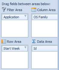
How’d we do this? On the Analyze Sessions tree node in Analyst, do the following to get to the configuration displayed on the right:
- Drag the Application field into the Filter Area. Click on the Application in the grid and click on the Filter icon in the upper right-hand corner to narrow the scope to just one application. We selected Analyst in our example.
- Drag the Version (X.Y.Z) field to the Column Area. This indicates that we use three-place version numbering for this chart. (We’ll ignore versions that are only different in the fourth place)
- Drag the Start Week field to the Row Area. You can now see in the grid area all of the versions shown on one side and the weeks on another. Let’s filter the weeks to just show this year - we’ll uncheck everything that isn’t 2012.
- Drag the Id column to the Data Area. The ID column will have a unique entry for every single session (it’s the unique Id of the session) so we’ll get a unique count.
- At this point the grid shows all of the data we need, we just need to add it to the chart. To do this, select all of the data columns in the Grid, skipping the Grand Total. This will promote that data to the chart.
- The chart is by default a bar chart, which is often fine but what we really want is a stacked area chart to give us a natural feel of both the total volume of sessions and the relative versions in use. Click the edit chart button in the tool bar to display the Chart Wizard and select the “Area Stacked” type then click Finish to switch the chart.
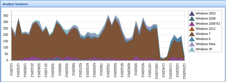
You can do many other analysis - here’s the same chart but with the Version (X.Y.Z) column removed and the OS Family column put in the Column Area instead:
You can use the Preview button the toolbar to get the chart in a print or export ready version you can customize or click the Save button to export the grid contents to Excel for your own nefarious plot.
And there you go! Interested in us baking in your favorite analysis or some other feature? Let us know!


