Extensible UI: Usability challenges and solutions
We spend a lot of time worrying about the usability of Gibraltar. Our goal is to have our brand known for creating intuitive, attractive products even though we develop exclusively for a platform that (often unjustly) is maligned on the same points.
From Where We Are
One part we agonized over at length (and did a number of mockups, prototypes, revisions, experiments…) was how to handle creating on-demand extra views of session data. In the current release of Analyst there are five types of views, three of which you can create multiple independent copies of. To solve this, we created a “blank” tab for each type that could be created dynamically to make it clear what the different potential views were and create new copies.
There are some awkward issues with this:
- Poor experience curve: The three targets for creating the distinctly different new views don’t quickly pop out of the noise of the page. Once you’ve crossed through the initial phase of discovery you can’t really get quicker (develop muscle memory) at selecting the right item, particularly since they move to the right as you create new documents.
- No room to grow: Three distinct items is the upper bound of credibility for this approach. Otherwise, it’d just take up too much room and you’d miss the left items, they would just blend in.
- Limited discovery: For a range of technical reasons you couldn’t get much of a hint to why you should pick a specific option. You pretty much have two words and a 16 pixel image.
Adding the ability to create session views pushed us over the edge - now users can create an unbounded number of unique views that need to plug right into this user interface. There’s no way that’s going to fly with this approach.
On to Something Better
So, we needed a two step approach to give us a lot more UI surface to work with when picking the specific view a user wants:
Now there’s just one target to click to create a new view, and while it does still move to the right, it’s always the right-most target so it’s easy to pick out of the view. The biggest problem is discovery, and we’re worried about that: Will someone who opens the session view the first time realize just how much great stuff is available through new views? We’ll have to find out.
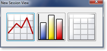
Once you select New View we have a second problem: How to pick the view you want. Here’s the first approach we beta tested:
There are some good things going for this selection:
- Big targets: Each button is very large and visually distinct and suggestive of the type of view you’re creating.
- Good experience curve: Their positions are fixed, and the dialog shows in the center of the session viewer so you can be reaching for what you want before the dialog even shows because you know where it’s going to be.
- Good discovery: At this level we have the room to show a very large tooltip as you hover over an item to tell you about what it is and why you’d want it (not shown in the picture).
- Extensible: We can easily add more items without breaking the paradigm: We could add more buttons up to about 9 before it would significantly break down (but you’ll see below we went a different way)
Still, for some users it still felt awkward: Some of our experienced users still had to pause each time, stare at the dialog, and then select. This led to another round of prototypes and an improved version:
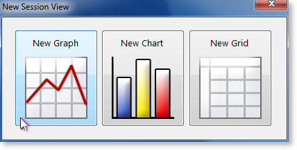
In this version, we’ve done two things:
- Text and Graphics: To accommodate the fact that some people scan graphically and some scan for content we added a text label that’s always visible even without a tooltip. The tooltip is still there to add expository but many people won’t start hovering over the icon until they think it’s the right one.
- More air to look more interactive: By increasing the padding around the graphics the visual effects of mouseover and focus make the display feel more friendly and interactive. It encourages hovering over an item before you’re sure it’s valid.
You can see the effect of the extra air when the mouse is hovering over a button:
Now With Your Extensions
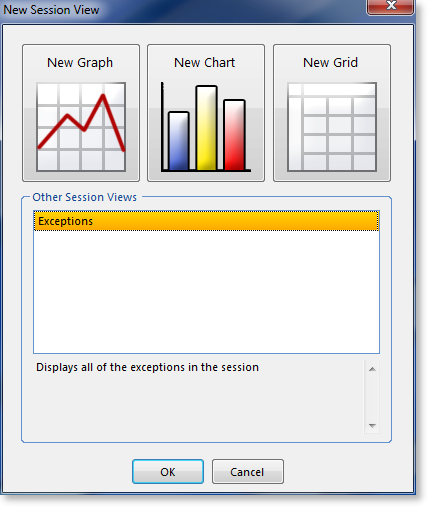
Finally, if you go ahead and add some add ins that create their own custom views this dialog automatically extends to give you those choices. In this case it’s clear which are the intrinsic views and which are extension views. We’ve also set aside space for the extension views to describe themselves. Developers hate empty visible boxes so we hope creating clear space in the dialog will encourage them to create good descriptions.
We’re running the risk that this approach is too optimized around an assumption that there will be a lot of add-ins, but it still provides good discoverability without making it more complicated to create add-ins. Plus, it only unfolds the additional complexity of managing these extra views if there are any around that need it.
Soon it’ll be Your Turn
We’re going to release a beta of Gibraltar 2.2 imminently. We’re considering it a beta because of the new add-in API which we want to get a broader set of feedback on before we’re committed to its design. The rest of the product has to pass all of our normal tests, so there’s going to be plenty of reason to upgrade to this version.
We’d love to hear your feedback on what you think of the changes we’ve made, the new API, and how we can continue to make the product easier to discover and more effective to grow with you. We expect Gibraltar to be a tool that works on many levels to reward beginners and experts alike. Hold us to it!


