Charting and analysis updates from real-world experience
I spend most of my time on the development side of Gibraltar - I lead the team writing the code and supporting our customers. I sometimes get involved in presales activities - if you click our web site chat link, it’s a good bet I’m on the other side - but the bulk of our marketing and presales work is done by my partner Jay. A few times a week we discuss what he’s hearing from folks trying out Gibraltar and we decide if we need to make any adjustments to our development plans. We give first priority to development requests from our customers, then prospects, then the fun cool ideas we have. Every once in a while those ideas collide at the same time and we know we’re onto something.
Several weeks ago I was handling a support request from a new customer and Jay had a conversation with a prospect that hit on the same issues: Our charting features for metrics looked really good on the surface, but fell down in real life:
- Really Long Strings: Our customer wanted to track the execution characteristics of every database query, and used dynamic SQL - so the query could be really long. If a label was longer than you could show diagonally on the screen, the whole chart wouldn’t show.
- Outlier Filtering: In any set of data some weird points will fall. Perhaps your code was just spinning up or whatever, it should be ignored.
- Show Me the Money: It’s all great you can summarize the information, but what details went into that? To take actions on the information most people ended up replicating the chart in the Metric Grid tool to see the individual elements of data to work with.
- Bad Topping: When you added secondary data to a chart you were topping (restricting the display to the Top N values) it re-topped the secondary data, causing downright bizarre results.
Now, we knew about the last two of them but the first two came out from real users solving problems with Gibraltar. Frankly, our test data always generated relatively short strings partly because we knew how our tool worked and how to get good results from it. The killer comment came from our prospective customer, and it hurt:
I mean, it all looks nice but basically it’s demoware until you address these issues
Ouch.
We hate demoware. We will not make demoware. This hurt even more because we really believe in the need for great charting - it’s important, it’s one of the things really unique about Gibraltar, and yet we also had a list of things we wanted to do with it. The trouble is we have a list of things we’d like to do with just about every part of the product; we’re insanely passionate about application diagnostics.
So we wrote out a set of things we had to address and moved this to the front of the development queue. We got sample data from a few customers we knew were using the feature and having trouble and went to work.
Previously we prepared the data and fed it to the chart control for analysis. Unfortunately, to fix the topping problem would be really problematic with the chart doing the work - the control vendor disagreed that what we wanted was sensible and working around it was going to be complicated. Additionally, we were jittery about having the same calculation done two different ways - one way to show the details and another to display the data. In the end, we chose to rewrite the analysis into a central set of code we could check and control. That way we could guarantee the results were consistent, and tailor them to our needs.
That’s just the way the breaks go - some things are easy, some are hard, but in the end it’s about what it’s worth to our customers. Here’s what’s fun and new:
See the Details
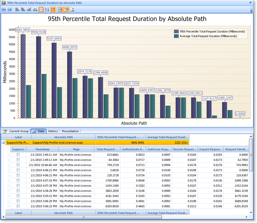
As the data is grouped up you can see all of the raw data that went into it. Don’t like one outlier? You can suppress it and immediately see the chart change to show how that affects the analysis. Curious as to why there’s a big spike in the chart? Click it and look at the individual rows to see the little details to know what to do.
This is one place I really love what we do vs. traditional performance profiling: You can see not just the overall time used by a method but the exact parameters used for each call and their individual time to know if it’s a problem of just one particular set of options taking a lot of time or the method is generally slow. This is useful to eliminate false leads so you know what methods are really worth profiling with your full up performance tool. The great part is that it’s safe for use in production - which gives you much more accurate information on what really matters.
Have hundreds of group items? That’s OK too - we’ll automatically scroll the chart to keep things at a sensible size. Otherwise, you can use the Top feature to just show the most significant information, whether that’s based on a top count, percentage, or threshold.
Without the Noise
In the real world there’s always some noise in the data - points that will lead you astray. In particular, if you’re looking at the duration of something you really shouldn’t judge its performance on the average or maximum; the maximum is likely a worst case scenario that reflects first time startup or a transient and the average will hide operations that are often slow, and often fast. The problem is that you’re still upsetting users with the slow ones.
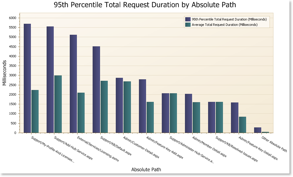
To resolve this, we’ve implemented a 95th percentile performance summarization that gives you a good real-world feel for performance data. Here’s an example from our web site:
Notice that if you sorted by the average page duration instead of the 95th percentile you wouldn’t get the same pages floating to the top. It’s clear from this that we have a few pages that are consistently slow for some users - we’ll definitely be taking a look at that!
Work with Any Data
We’re often… impressed… with what people do with Gibraltar. We’ve seen proof positive that if you design a product to go to X, users will immediately take it to 3X. We’ve previously addressed some edge cases with the log viewer, now we’ve applied the same lessons to Metric Charting. Want to group by raw SQL Statements that are a page long? No problem. It’ll be fast, it’ll display, and you won’t have to worry about tooltips trying to go off the edges of the screen.
Need to still be able to see the full page of SQL when you find that slow request? Yep, you can do that too.
With more Freedom
Previously, you could only chart a single metric at a time. This was a big coding shortcut, and it worked for us internally because we designed our metrics to work with it. But, in the real world things aren’t quite that simple. Our own Agent for PostSharp, which is probably the way most people start trying out metrics, records data in multiple metrics and really can’t be charted well if you can’t throw a bunch of them together.
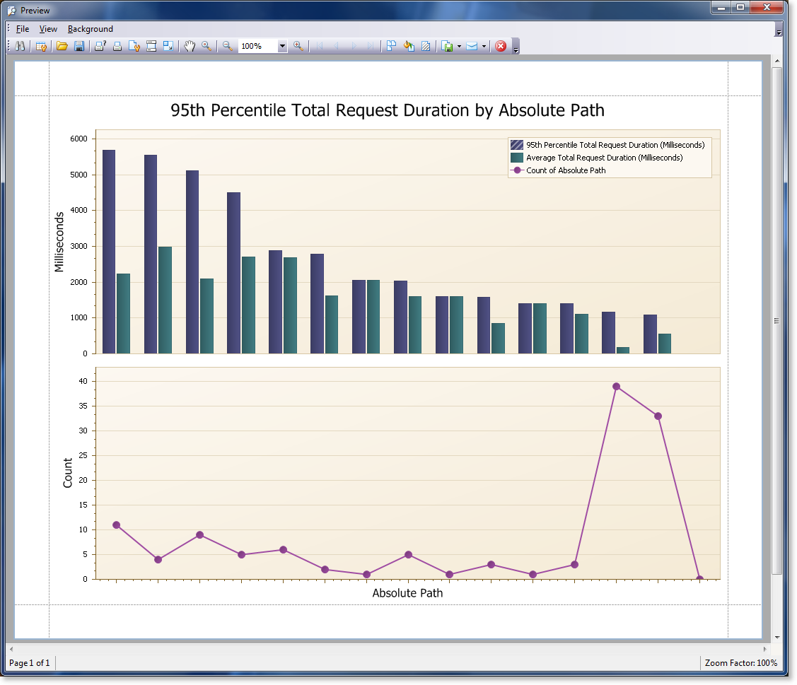
We’ve updated the charting to let you throw just about any combination of metrics together you think could be sensibly put together - and it’ll figure out what columns are common enough and can be graphed. In the end there are a range of reasons why you might want to record metrics in different ways in your application - and we’d rather you could do what was convenient and minimize how much you have to worry about how it shows up in Analyst.
We’ve also made the charting more configurable - you can change most of the different labels if you don’t like the autogenerated values and show or hide various elements to get the chart the way you want it. When you’re done, you can export it right to the format of your choice
Bringing it All Together
I hope you get a sense from the pictures above just how much you can do with the new metric charting features, but there’s no substitute for downloading a trial and seeing it for yourself. All of the data behind the charts in this example was collected using the Gibraltar Agent for ASP.NET so no coding was necessary to get these results. Try it and you’ll see that Gibraltar can help you solve problems in the real world you live in, not just in some theoretical abstract place where demos happen.
Check out our recent post on [I spend most of my time on the development side of Gibraltar - I lead the team writing the code and supporting our customers. I sometimes get involved in presales activities - if you click our web site chat link, it’s a good bet I’m on the other side - but the bulk of our marketing and presales work is done by my partner Jay. A few times a week we discuss what he’s hearing from folks trying out Gibraltar and we decide if we need to make any adjustments to our development plans. We give first priority to development requests from our customers, then prospects, then the fun cool ideas we have. Every once in a while those ideas collide at the same time and we know we’re onto something.
Several weeks ago I was handling a support request from a new customer and Jay had a conversation with a prospect that hit on the same issues: Our charting features for metrics looked really good on the surface, but fell down in real life:
- Really Long Strings: Our customer wanted to track the execution characteristics of every database query, and used dynamic SQL - so the query could be really long. If a label was longer than you could show diagonally on the screen, the whole chart wouldn’t show.
- Outlier Filtering: In any set of data some weird points will fall. Perhaps your code was just spinning up or whatever, it should be ignored.
- Show Me the Money: It’s all great you can summarize the information, but what details went into that? To take actions on the information most people ended up replicating the chart in the Metric Grid tool to see the individual elements of data to work with.
- Bad Topping: When you added secondary data to a chart you were topping (restricting the display to the Top N values) it re-topped the secondary data, causing downright bizarre results.
Now, we knew about the last two of them but the first two came out from real users solving problems with Gibraltar. Frankly, our test data always generated relatively short strings partly because we knew how our tool worked and how to get good results from it. The killer comment came from our prospective customer, and it hurt:
I mean, it all looks nice but basically it’s demoware until you address these issues
Ouch.
We hate demoware. We will not make demoware. This hurt even more because we really believe in the need for great charting - it’s important, it’s one of the things really unique about Gibraltar, and yet we also had a list of things we wanted to do with it. The trouble is we have a list of things we’d like to do with just about every part of the product; we’re insanely passionate about application diagnostics.
So we wrote out a set of things we had to address and moved this to the front of the development queue. We got sample data from a few customers we knew were using the feature and having trouble and went to work.
Previously we prepared the data and fed it to the chart control for analysis. Unfortunately, to fix the topping problem would be really problematic with the chart doing the work - the control vendor disagreed that what we wanted was sensible and working around it was going to be complicated. Additionally, we were jittery about having the same calculation done two different ways - one way to show the details and another to display the data. In the end, we chose to rewrite the analysis into a central set of code we could check and control. That way we could guarantee the results were consistent, and tailor them to our needs.
That’s just the way the breaks go - some things are easy, some are hard, but in the end it’s about what it’s worth to our customers. Here’s what’s fun and new:
See the Details
As the data is grouped up you can see all of the raw data that went into it. Don’t like one outlier? You can suppress it and immediately see the chart change to show how that affects the analysis. Curious as to why there’s a big spike in the chart? Click it and look at the individual rows to see the little details to know what to do.
This is one place I really love what we do vs. traditional performance profiling: You can see not just the overall time used by a method but the exact parameters used for each call and their individual time to know if it’s a problem of just one particular set of options taking a lot of time or the method is generally slow. This is useful to eliminate false leads so you know what methods are really worth profiling with your full up performance tool. The great part is that it’s safe for use in production - which gives you much more accurate information on what really matters.
Have hundreds of group items? That’s OK too - we’ll automatically scroll the chart to keep things at a sensible size. Otherwise, you can use the Top feature to just show the most significant information, whether that’s based on a top count, percentage, or threshold.
Without the Noise
In the real world there’s always some noise in the data - points that will lead you astray. In particular, if you’re looking at the duration of something you really shouldn’t judge its performance on the average or maximum; the maximum is likely a worst case scenario that reflects first time startup or a transient and the average will hide operations that are often slow, and often fast. The problem is that you’re still upsetting users with the slow ones.
To resolve this, we’ve implemented a 95th percentile performance summarization that gives you a good real-world feel for performance data. Here’s an example from our web site:
Notice that if you sorted by the average page duration instead of the 95th percentile you wouldn’t get the same pages floating to the top. It’s clear from this that we have a few pages that are consistently slow for some users - we’ll definitely be taking a look at that!
Work with Any Data
We’re often… impressed… with what people do with Gibraltar. We’ve seen proof positive that if you design a product to go to X, users will immediately take it to 3X. We’ve previously addressed some edge cases with the log viewer, now we’ve applied the same lessons to Metric Charting. Want to group by raw SQL Statements that are a page long? No problem. It’ll be fast, it’ll display, and you won’t have to worry about tooltips trying to go off the edges of the screen.
Need to still be able to see the full page of SQL when you find that slow request? Yep, you can do that too.
With more Freedom
Previously, you could only chart a single metric at a time. This was a big coding shortcut, and it worked for us internally because we designed our metrics to work with it. But, in the real world things aren’t quite that simple. Our own Agent for PostSharp, which is probably the way most people start trying out metrics, records data in multiple metrics and really can’t be charted well if you can’t throw a bunch of them together.
We’ve updated the charting to let you throw just about any combination of metrics together you think could be sensibly put together - and it’ll figure out what columns are common enough and can be graphed. In the end there are a range of reasons why you might want to record metrics in different ways in your application - and we’d rather you could do what was convenient and minimize how much you have to worry about how it shows up in Analyst.
We’ve also made the charting more configurable - you can change most of the different labels if you don’t like the autogenerated values and show or hide various elements to get the chart the way you want it. When you’re done, you can export it right to the format of your choice
Bringing it All Together
I hope you get a sense from the pictures above just how much you can do with the new metric charting features, but there’s no substitute for downloading a trial and seeing it for yourself. All of the data behind the charts in this example was collected using the Gibraltar Agent for ASP.NET so no coding was necessary to get these results. Try it and you’ll see that Gibraltar can help you solve problems in the real world you live in, not just in some theoretical abstract place where demos happen.
Check out our recent post on](/blog/first-do-no-harm-designing-robust-infrastructure “First, Do No Harm - Designing Robust Infrastructure”) for another example of how we are incorporating customer feedback to help you build rock solid .NET software.


