Application Metrics Graphing with Loupe Desktop
I’ve been recording a Loupe tutorial series (expect more on that soon), and in the process of doing so, I have rediscovered a feature of Loupe Desktop: The New Session View. This feature allows you to take data from your application and generate graphs, charts, and spreadsheets (called grids in-app). It’s a great way to investigate your application quickly or present different metrics data to your colleagues.
Let’s go over how you can visualize your application metrics with the New Session View feature in Loupe.
Creating a Graph
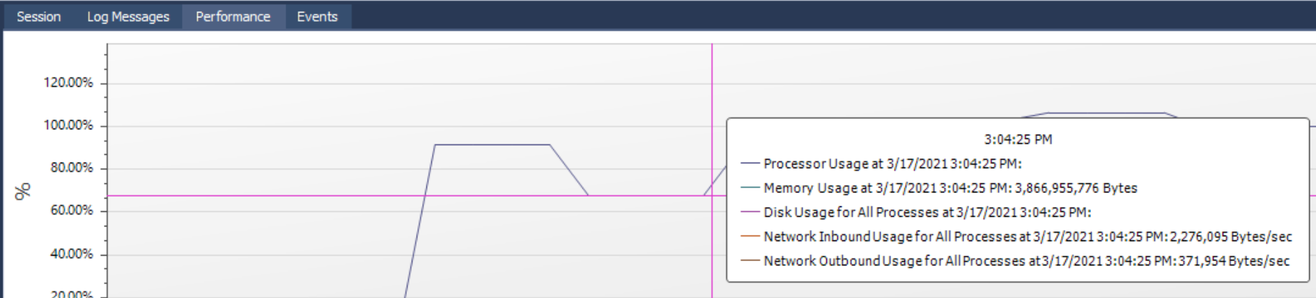
You may have seen an example of the graph view in Loupe desktop if you have viewed the performance tab in the session viewer.
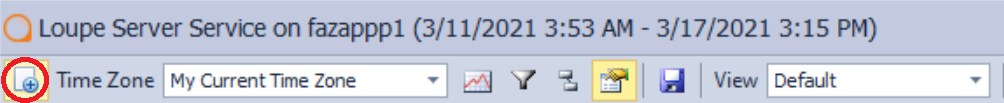
But with the new session view, you get more control over which metrics you want to graph. To create a graph, you want to click on the “New Session View” button in the menu bar on top of the session viewer. You will press the same button to make charts or spreadsheets as well. Below is a screenshot of the button, circled in red.
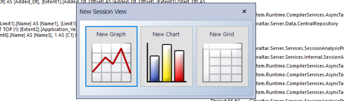
When you press the button, you will see options to make a new graph chart, or grid (AKA, a spreadsheet). Simply click on the option you want to use, and the New Session View editor will open.
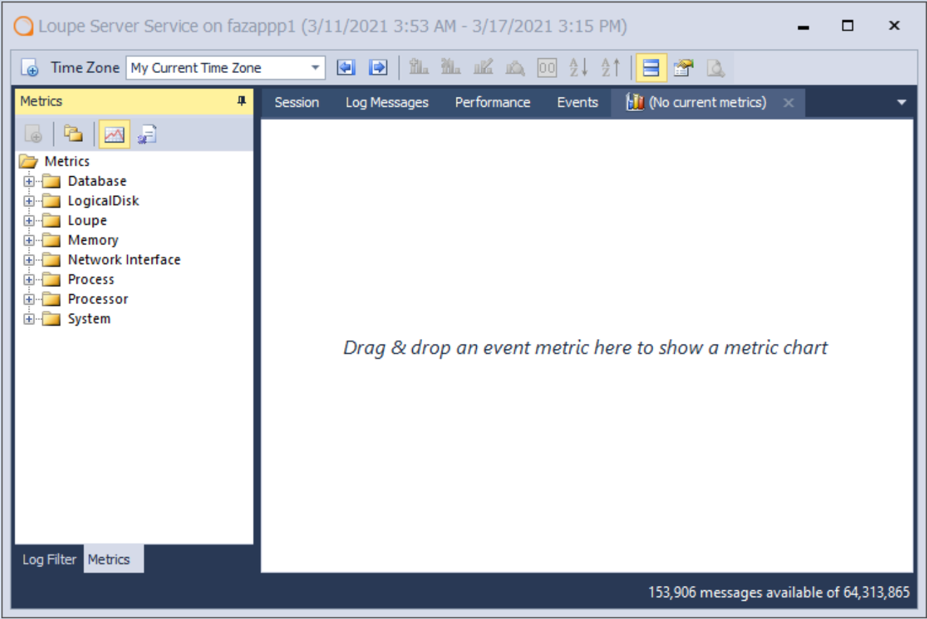
In the new session view editor, you will see a list of available application metrics and a viewing area.
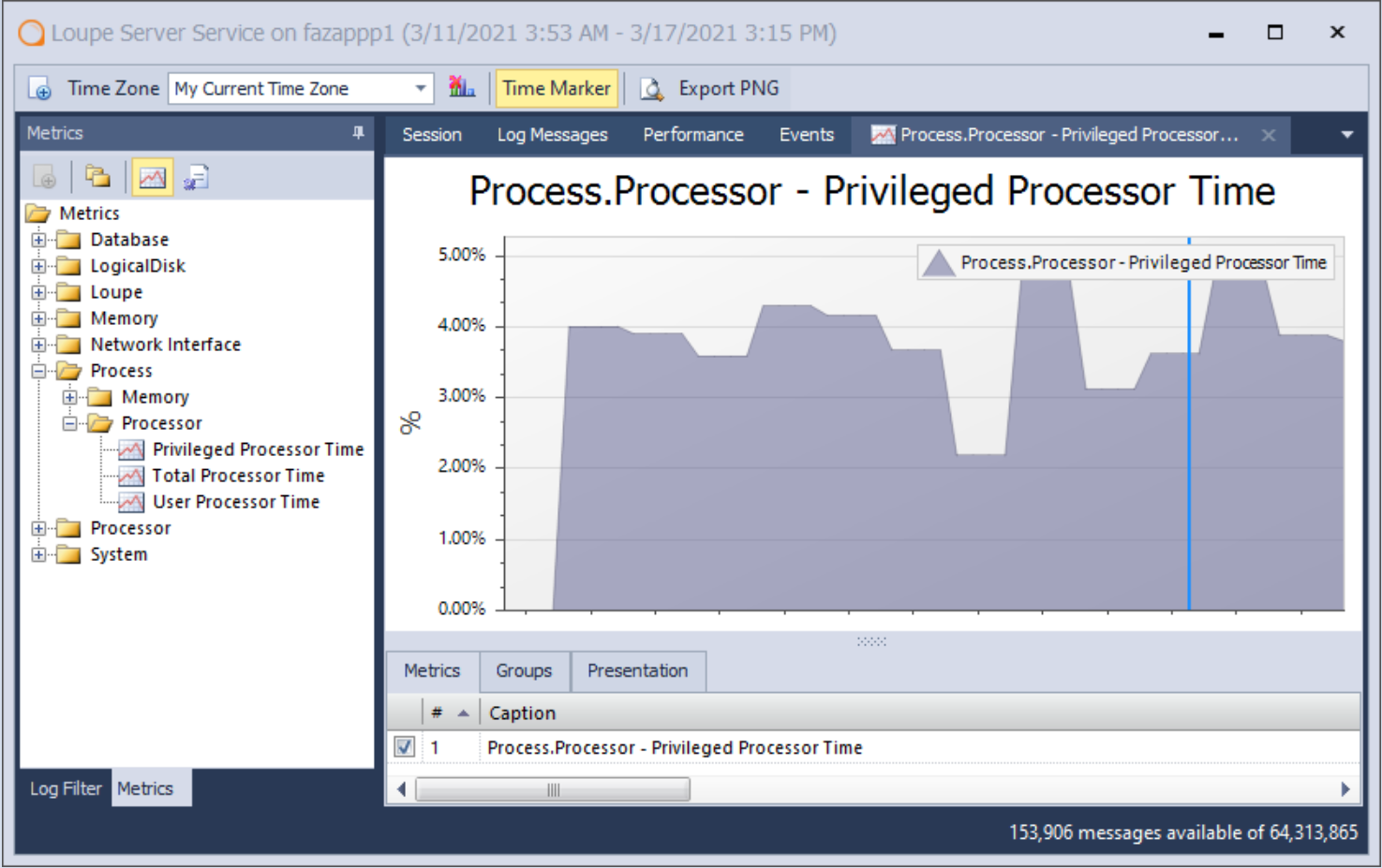
Making a graph is easy at this point. Simply drag the metric you want to view onto the viewing area, and Loupe will generate a graph based on that data. For example, if I opened the processor folder and dragged the “privileged processor time” metric onto the viewing area, I would get the following graph:
Loupe uses the same drag and drop interface for creating charts and spreadsheets as well. It allows users to display their data visually very quickly. And of course, you can just export the charts to PNG and easily share the data with others (or export spreadsheets to excel).
So, graphing application metrics with Loupe desktop is easy enough, but it’s worth discussing the metrics you can use with Loupe.
What Application Metrics Can be Used with Loupe?
Metric data for Loupe breaks down into two categories: event metrics and sampled metrics.
Event Metrics
Event metrics are collected per event, meaning that the metric is collected when a specific action is taken. An example metric for the Loupe Server Service is the database query.
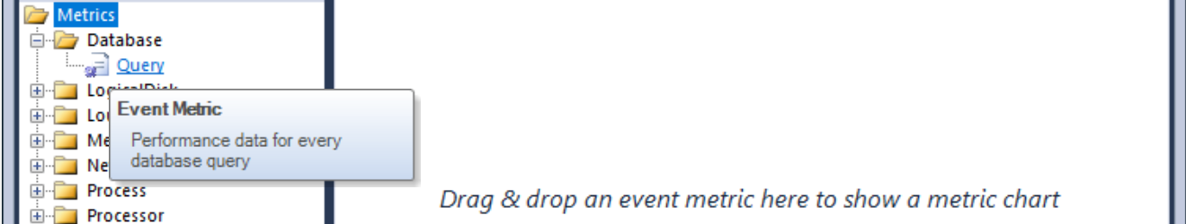
This query metric contains multiple metrics collected every time a query is made on the Loupe Server Service. If we drag the metric onto the viewing area, Loupe will first prompt us to pick the specific metrics we want to graph.
It is often a best practice to collect multiple metrics per event. In the case of our query event, we collect many metrics, including:
-
The Name of the database which used the query
-
The Duration, how long the query took to complete
-
The Query name, which query was called
-
The Result, whether the query was successful or not
We collect these metrics for the event because it would be hard to answer the questions we want Loupe to answer without each metric. If I knew that a query was taking forever and failing, for example, it would be extremely frustrating not to know the name of that query and on which database it is taking place. That example should give you a taste of the kind of metrics you would want to collect with an event metric, but you can view our documentation for a deeper dive.
In short, event metrics are for tracking multiple data points for a specific event. What that event metric contains is up to you.
Sampled Metrics
Sampled metrics, on the other hand, are collected periodically as the application runs. This is an excellent option for metrics like the size of a cache file or processor utilization.
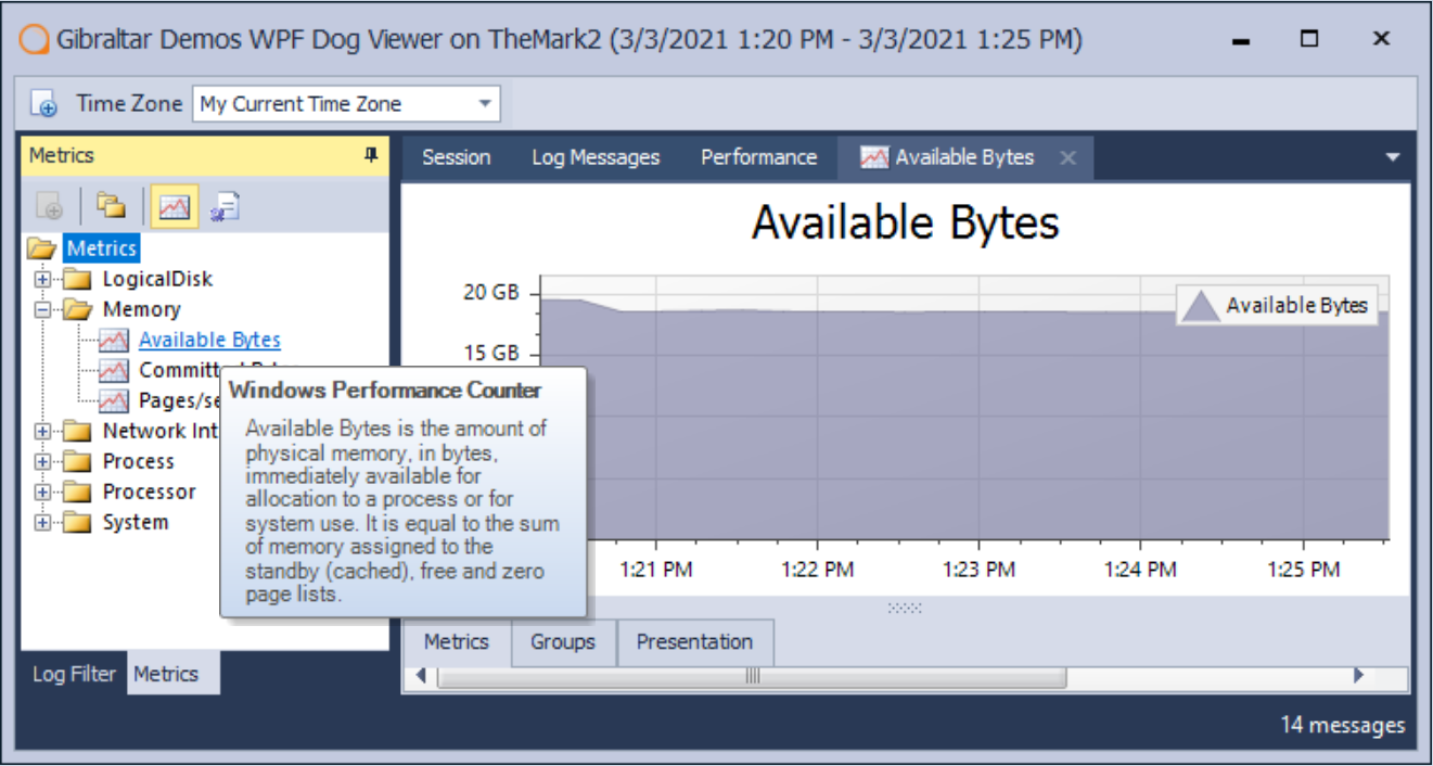
Windows Performance Counters are an example of a sampled metric tracked by Loupe. Below is a screenshot showing a graph of available bytes of memory during a session of a local WPF application and the available metric. What’s neat about this example is I didn’t need to do any additional configuration to my application to use this metric in the new session view. I was able to chart some data before writing any more code.
Sampled metrics are great for metrics that would make no sense or be too resource-intensive to measure per event. You can learn more about how to implement sampled metrics for Loupe in our documentation.
One More Thing
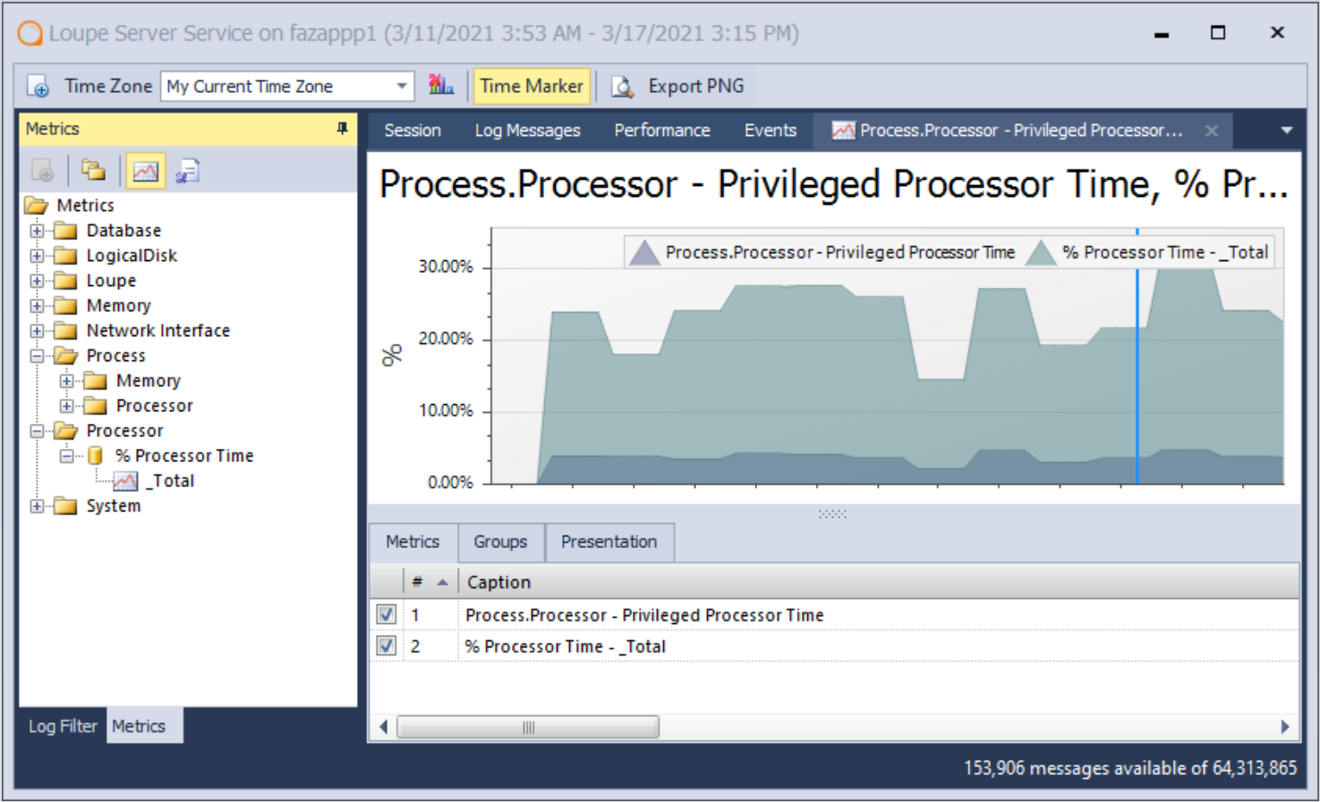
Before you leave to make your own graphs, I want you to note that you can chart more than one metric at the same time, such as this graph that shows “privileged processor time” and “processor time total” overlaying each other.
You can try out our application metrics graphing with the New Session View for free with Loupe Desktop! Follow the link below to learn more about everything else Loupe Desktop can help you track for .NET and Java applications.