A Look at the Loupe 5 UI
Even for our users that don’t keep up with this blog, the release of Loupe 5 will be obvious. That’s because we are completely changing the User Interface. For me, it is the most significant change from Loupe 4 to Loupe 5. I have enjoyed using the internal version of Loupe 5 for a while, largely because of the extra efficiency the new UI has afforded me.
Here, we will go over what the changes mean for navigating Loupe 5, and take a look at some new screens.
Starting at the Top: Navigating Loupe 5
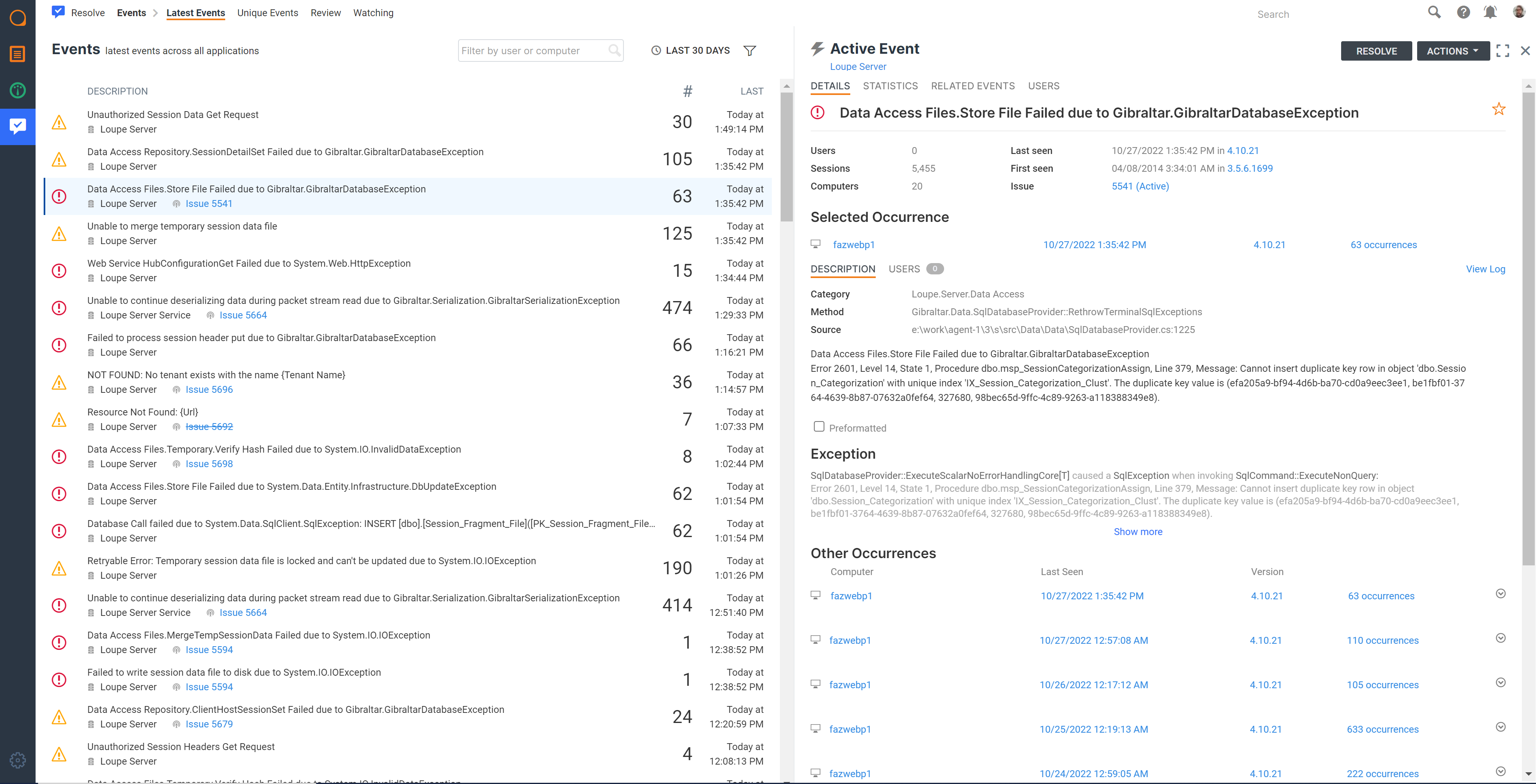
Our new primary navigation is simplified from Loupe 4. The Loupe 5 UI is clearly divided by module on the left-hand side. On top, we place the module-specific navigation items. For example, the below screenshot shows a user in the Resolve Module with the Events list navigation items on the top of the screen:

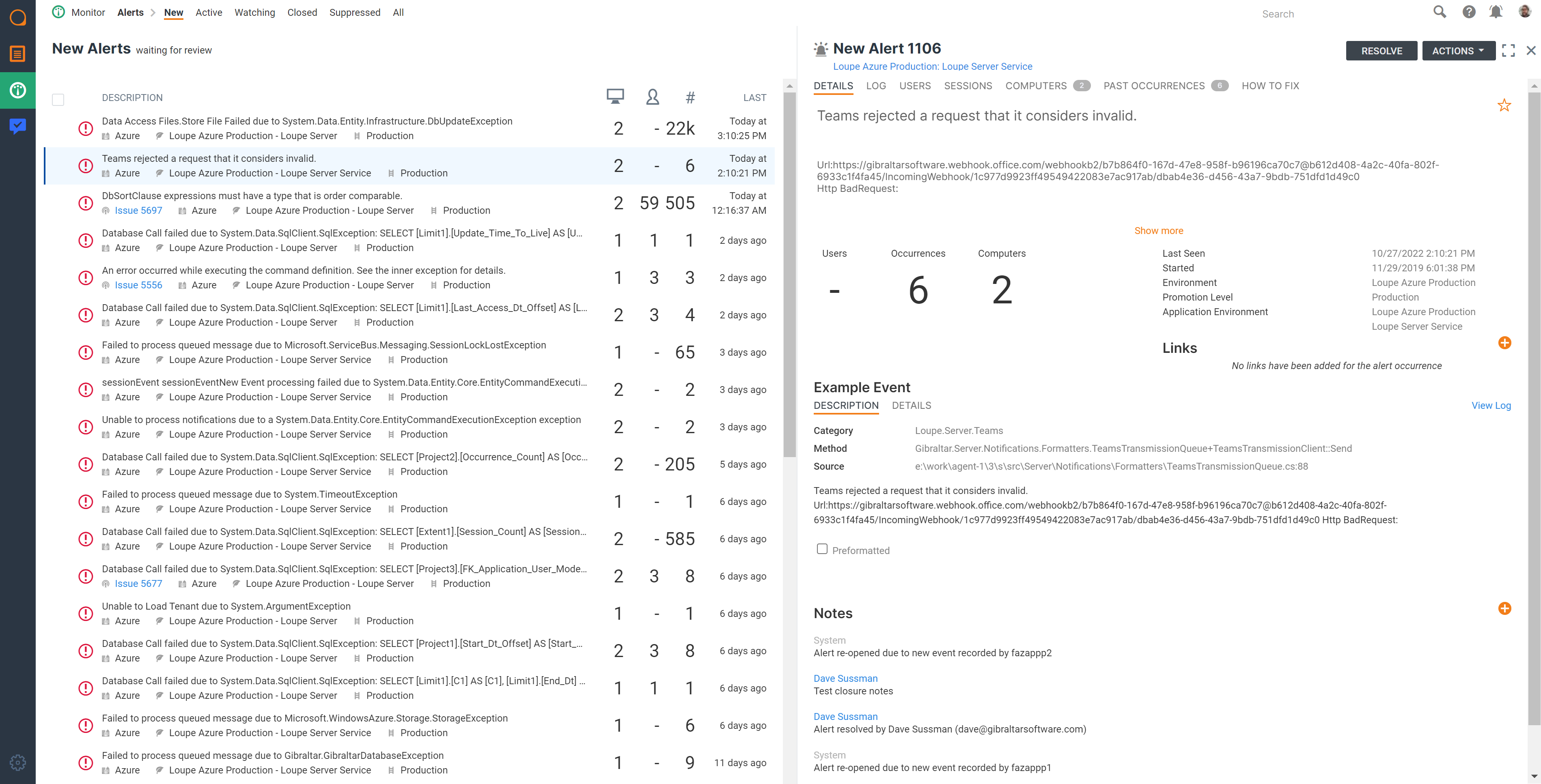
And here’s a screenshot of the Monitor Module with the Alert list navigation on the top of the screen:

Both examples show a consistent left-hand navigation while adjusting the top navigation based on the individual module. This allows users to navigate within a single module effectively while never being more than a click away from View (the log viewer), Monitor (the APM), or Resolve (the defect tracking system).
Exploring the Split-Screen User Interface
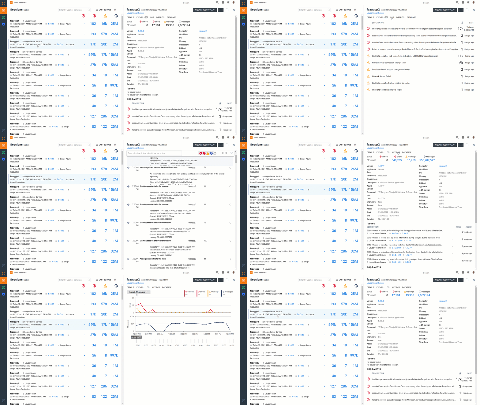
Loupe 5 is designed to maximize widescreen interfaces, like most desktops and tablets. Let’s take a look at two example workflows. Here is one from Loupe View, jumping from one session to another from the same list:

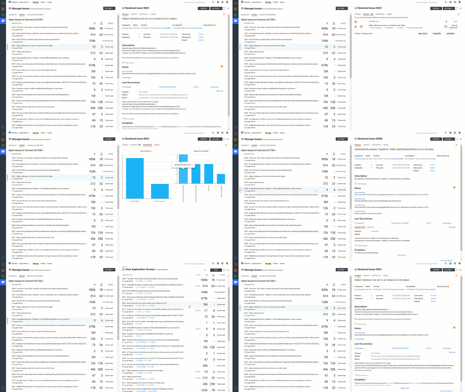
It’s worth noting that this example also shows a seamless jump between modules, as the metrics tab in Loupe View is pulling data processed by Loupe Monitor. Below is another example from Loupe Resolve looking at the open issues list:

This workflow shows the user viewing specific event details, but also jumping to the “Open Issue” list for a different version of their software. All of this while still having access to the original list. It’s a design that helps those who get lost in the details. Loupe 5 allows you to follow your instincts and investigate your data thoroughly, but not lose the bigger picture.
At the very beginning of the year, I started using the internal version of Loupe 5 for my everyday work. The split screen UI has been a game changer for myself, and I strongly believe it will be for others as well.
What About Loupe 5 in Action
Loupe 5 is coming out soon, and our cloud users will notice. But if you want a longer look at Loupe 5 right now, you can watch the Loupe View Demo below.
And as a bonus, here’s a video showing some search functionality in Loupe 5: